In summary:
- Stop fighting cold, northern light with brilliant white; it amplifies coolness. Instead, use neutrals with soft yellow or pink undertones to absorb and warm the light.
- Counteract the flatness of neutral palettes by layering a rich variety of textures: combine wool, linen, wood, and ceramic to create visual and tactile depth.
- Choose a matte or eggshell paint finish over gloss. Matte paint diffuses light softly, preventing the harsh glare that gloss creates in low-light conditions.
- Structure your space with the Nordic 60-30-10 rule: 60% dominant neutral, 30% secondary neutral, and 10% subtle, nature-inspired accents.
- The ultimate goal is to create a ‘hygge’ atmosphere—a sanctuary of comfort achieved through a multi-sensory approach to light, texture, and ritual.
For many homeowners in Britain, the arrival of winter brings a familiar challenge: the beautiful character of a heritage home, particularly rooms facing north, can suddenly feel dark, draining, and perpetually gloomy. The default reaction is often to reach for a can of brilliant white paint, believing it to be the universal soldier in the war against darkness. We are told to « add mirrors » and « keep it light, » but often find these efforts result in a space that feels even colder and less inviting than before.
This common struggle stems from a misunderstanding of the nature of light itself. The cool, blue-ish light that filters through a north-facing window on an overcast day is a specific environmental factor, not a problem to be eradicated. But what if the true solution wasn’t to fight this light, but to manage it? What if the key lay not in reflective power, but in the sophisticated application of colour theory and texture, as perfected in Scandinavia where long, dark winters are a way of life?
As a Scandinavian colour theorist specializing in the nuances of British homes, I propose a different approach. It’s about embracing the inherent qualities of your space and using a palette of carefully selected neutrals to absorb, soften, and enrich the light you have. This guide moves beyond simplistic advice to provide a foundational understanding of how colour, finish, and texture interact with northern light. We will dismantle common myths, explore the science of perception, and build a strategy, layer by layer, to transform your room from a cold cavern into a warm, restorative ‘hygge’ sanctuary.
This article will guide you through the core principles of the Scandinavian approach, from selecting the right undertones to layering light sources. By understanding these concepts, you can create a space that feels bright, welcoming, and deeply comforting, even on the darkest of winter days.
Contents: How to Master Nordic Neutrals for British Winters
- Why Painting a Dark Room Brilliant White Actually Makes It Feel Colder?
- Which Works Best for North-Facing Rooms Between Warm Undertones and Cool Undertones?
- How to Layer Textures to Prevent a Neutral Room From Feeling Flat
- The Gloss Paint Mistake That Creates Harsh Glare Instead of Soft Light Reflection
- How to Introduce Subtle Accent Colours Without Breaking the Minimalist Aesthetic
- Why Dark Heavy Furniture Subconsciously Shrinks Your Perception of Room Size?
- How to Map Multiple Low-Level Light Sources for Ultimate Evening Relaxation
- How to Cultivate a Cozy Hygge Atmosphere to Decompress After a Hectic London Commute
Why Painting a Dark Room Brilliant White Actually Makes It Feel Colder?
The belief that brilliant white paint is the ultimate solution for a dark room is one of the most persistent myths in interior design. The logic seems sound: white reflects the most light, therefore it should make a room feel brighter. However, this fails to account for the *quality* and *colour temperature* of the light being reflected. North-facing rooms in the UK, especially during winter, receive indirect light that is inherently cool and blue-toned. In fact, research on natural light characteristics reveals that north-facing windows maintain a consistent color temperature of around 6500K, which is equivalent to overcast daylight.
When brilliant white, which often has a blue or grey base, is used on the walls, it doesn’t warm this light; it simply reflects it back with its cool properties amplified. The result is a room that feels stark, clinical, and perceptibly colder. This effect is a form of metamerism, a phenomenon where a colour’s appearance shifts dramatically under different light sources. As explained by colour science, the tristimulus values our eyes perceive change, making that « neutral » white suddenly appear grey, blue, or even slightly green.
Instead of creating a bright and welcoming space, you inadvertently create an environment that echoes the coldness of the outdoors. The white walls highlight every shadow, making the corners appear darker and the overall space feel less like a cozy retreat and more like an artist’s studio waiting for a subject. To truly succeed, we must abandon the idea of brute-force reflection and instead choose colours that intelligently manage and soften this cool light.
Which Works Best for North-Facing Rooms Between Warm Undertones and Cool Undertones?
Since we have established that the cool, blue-toned light of a north-facing room will only be amplified by cool-toned paints, the logical solution is to counteract it. This is where the power of warm undertones comes into play. Rather than fighting the nature of the light, we introduce colours that have a base of yellow, pink, or red. These undertones work to absorb the coolness and radiate a soft, gentle warmth back into the space.
Think of it as adding a warming filter to the light itself. A neutral with a yellow base will not look overtly yellow on the wall; instead, the northern light will neutralize much of the yellow, leaving behind a soft, creamy, and luminous white. Similarly, neutrals with a hint of red or pink in their base will lose their saccharine edge and resolve into a gentle, welcoming blush that feels sophisticated and comforting.
The key is to select colours that have enough warmth to stand up to the cool light without becoming overwhelming. Avoid anything with a grey, blue, or green base, as these will be exaggerated, making the room feel drab and chilly. As the experts at Farrow & Ball advise for northern light, « Yellow based colours like Yellow Ground, New White and White Tie will help to bounce as much light as possible around the room. » These complex neutrals have just the right amount of underlying warmth to create a balanced, light-filled atmosphere without appearing stark.
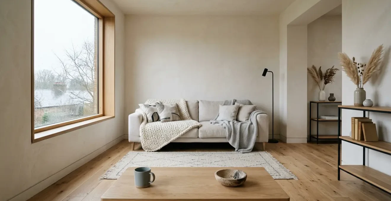
How to Layer Textures to Prevent a Neutral Room From Feeling Flat
Once you’ve selected the perfect warm neutral for your walls, the next challenge is to prevent the space from feeling one-dimensional or ‘flat’. A room decorated entirely in similar tones, no matter how beautiful, can lack depth and personality. The Scandinavian solution to this is a masterful layering of textures. This technique is about creating visual interest and tactile comfort by combining a variety of materials.
The goal is to engage the senses beyond just the visual. By placing contrasting textures next to each other, you create subtle highlights and shadows that add richness to the neutral palette. The interplay between a rough, nubby wool and a smooth, cool linen, or between matte ceramic and the organic grain of light wood, is what brings a minimalist space to life. This rich tapestry of materials ensures the room feels curated and cozy, rather than sterile and boring.

As the image above illustrates, the beauty is in the detail. The deep shadows in a chunky knit throw, the visible weave of a linen cushion, and the smooth surface of a ceramic vase all catch the light in different ways. This multi-sensory approach is fundamental to creating a ‘hygge’ environment. To implement this effectively, follow a simple formula:
- Start with a neutral foundation: Your warm off-white walls and a large furniture piece like a beige sofa serve as the canvas.
- Mix natural fibres: Combine textiles like wool, linen, and cotton through cushions, throws, and curtains.
- Incorporate organic elements: Introduce the raw textures of light wood, stone, woven baskets, or even house plants.
- Balance smooth and rough: Pair the softness of a velvet cushion with the raw grain of an oak side table, or a sleek metal lamp with a deep-pile rug.
- Consider layered rugs: Placing a smaller, subtly patterned or textured rug over a larger, neutral jute or sisal rug adds instant dimension.
The Gloss Paint Mistake That Creates Harsh Glare Instead of Soft Light Reflection
Choosing the right colour is only half the battle; the paint’s finish, or sheen, plays an equally critical role in how light behaves in your space. A common mistake is to assume that a high-gloss finish will maximize brightness. While gloss paint does reflect more light, it does so in a way that is counterproductive in a north-facing room. This is due to the difference between specular and diffuse reflection.
A high-gloss finish creates specular reflection, meaning it acts like a mirror. It reflects light in a single, concentrated direction, which in a room with limited or low-angle light, creates harsh hotspots and uncomfortable glare. Instead of illuminating the room, it bounces sharp beams of light that can be jarring to the eye, highlighting every minor imperfection on the wall surface. This works against our goal of creating a soft, serene atmosphere.
Conversely, matte or low-sheen (e.g., eggshell) finishes create diffuse reflection. As research on paint finish and light distribution confirms, these finishes scatter light gently in all directions. This soft, even distribution helps to create a luminous glow that fills the entire space. It absorbs shadows and minimizes imperfections, contributing to a calm and enveloping feeling. For a north-facing British room, where the light is already scarce and cool, a matte finish is your greatest ally. It works with the light you have to create a velvety, sophisticated backdrop that feels both bright and tranquil.
How to Introduce Subtle Accent Colours Without Breaking the Minimalist Aesthetic
A neutral palette is the foundation of a calm, light-filled space, but it risks feeling monotonous without the careful introduction of accent colours. The Scandinavian approach avoids loud, jarring contrasts. Instead, it favours a subtle and harmonious method rooted in the natural world, often using the 60-30-10 rule as a guiding principle. This formula provides a clear structure for building a balanced and sophisticated colour scheme.
The rule is simple: your room’s colour palette should be composed of 60% a dominant colour, 30% a secondary colour, and 10% an accent colour. In our context, this translates to a Nordic-inspired palette:
- 60% Dominant Neutral: This is your primary warm off-white on the walls and ceiling.
- 30% Secondary Neutral: This includes larger furniture pieces like a sofa, rugs, or curtains in a complementary neutral such as a soft grey, greige, or natural linen tone.
- 10% Accent Colour: This is where you introduce personality. The key is to choose muted, complex colours drawn from a Nordic winter landscape.
These accent colours should be deployed sparingly through small, easily changeable items like cushions, throws, artwork, or ceramics. This allows you to add depth and interest without overwhelming the serene, minimalist aesthetic. The image below perfectly captures the essence of these thoughtful, nature-derived accents.
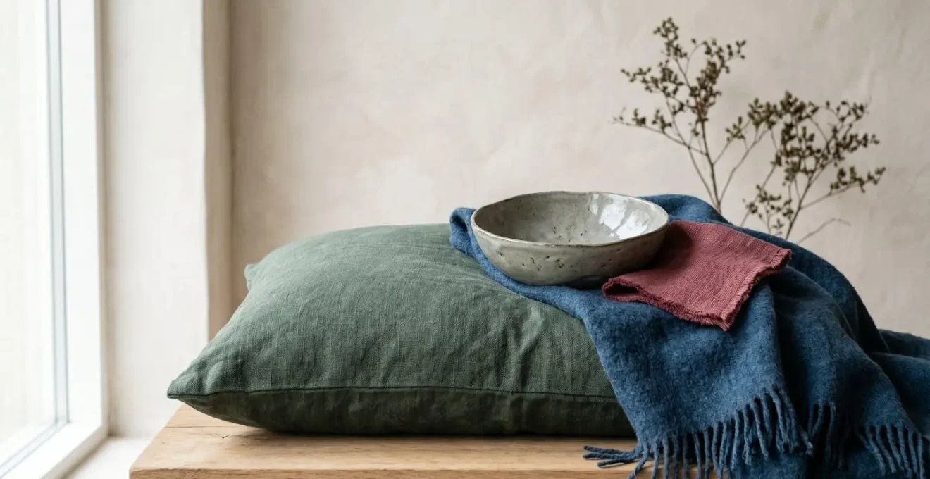
By using small touches of colour, you guide the eye around the room and create focal points that prevent the space from feeling static. This measured approach ensures the overall atmosphere remains calm and uncluttered, true to the minimalist spirit.
Action Plan: Implementing the 60-30-10 Nordic Rule
- Establish a 60% dominant neutral base: Use warm off-white or a very light greige for your walls, ceiling, and major trim to create a luminous canvas.
- Apply a 30% secondary neutral: Choose a complementary neutral for large items like your sofa, main rug, and curtains. This could be a light, warm grey or a natural linen/light wood tone.
- Introduce a 10% accent colour: Select one or two muted, nature-derived tones (e.g., desaturated pine green, fjord blue, winter berry red) for small, impactful items.
- Distribute accents thoughtfully: Place your 10% accent across three to five items like cushions, a single throw, a vase, or a piece of art to create a cohesive visual thread.
- Consider an ‘Accent Neutral’: For a truly minimalist feel, use charcoal or black as your 10% accent in thin-profile picture frames, lamp bases, or side table legs to ground the scheme.
Why Dark Heavy Furniture Subconsciously Shrinks Your Perception of Room Size?
The walls are not the only element that influences the perception of space; your furniture plays a profound psychological role. In a room with limited natural light, large, dark, and heavy-looking furniture can subconsciously make the space feel smaller, denser, and more oppressive. This is because our brains perceive dark, solid objects as having greater visual weight than lighter-coloured or more delicate pieces, even if they occupy the same physical footprint.
A solid, dark walnut bookcase that sits flat on the floor will feel far more massive and space-consuming than a light oak bookcase of the same dimensions that is raised on slender legs. The space visible underneath the ‘leggy’ furniture creates an illusion of openness, allowing light and air to flow more freely. This makes the room feel larger and less cluttered.
To maximize the feeling of light and space in a north-facing room, choose furniture that minimizes visual weight. Look for pieces with the following characteristics:
- Light-coloured materials: Opt for woods like ash, birch, or light oak, and upholstery in pale greys, creams, or linen tones.
- Slender profiles and ‘leggy’ design: Sofas, armchairs, and sideboards raised on legs feel less bulky.
- Reflective or transparent surfaces: Glass coffee tables, metallic frames, or mirrored cabinet doors can help bounce light without adding visual mass.
- Low-profile shapes: Choose sofas with low backs and furniture that doesn’t dominate the vertical space of the room.
By selecting furniture that feels light and airy, you work in harmony with your light-enhancing wall colour, creating a cohesive and expansive atmosphere.
How to Map Multiple Low-Level Light Sources for Ultimate Evening Relaxation
As day turns to evening, even the best-designed room for natural light must transition to artificial sources. A single, harsh overhead ceiling light is the enemy of a cozy atmosphere. The Scandinavian approach to lighting is all about creating ‘islands of light’ using multiple, low-level sources to build a warm, layered, and adaptable environment. This strategy banishes shadows and allows you to tailor the mood for any activity, from reading to relaxing.
The key is to think in layers: ambient, task, and accent lighting. Instead of one dominant source, you should aim for several smaller lamps strategically placed around the room. A simple and effective method is the ‘Lighting Triangle’, which ensures balanced, shadow-free illumination around your primary seating area. To achieve this, you should:
- Position three varied light sources in a triangle: For example, a floor lamp, a table lamp, and a wall sconce arranged around your sofa.
- Include a task light: A dedicated, adjustable floor or wall lamp next to an armchair is essential for comfortable reading.
- Add soft ambient light: Table lamps with fabric or paper shades diffuse light beautifully, creating a warm and gentle glow.
- Create depth with accent lights: An uplighter placed behind a large plant or a bookshelf can create dramatic shadows and make the room feel larger.
- Use warm white bulbs: Opt for bulbs with a colour temperature of around 2700K to mimic the warm, soothing light of a fire or candle.
- Install dimmer switches: Dimmers on every light source are non-negotiable. They provide the ultimate flexibility to adapt the room’s brightness and mood instantly.
By mapping out your lighting in this way, you create a dynamic and inviting space that feels just as comforting and welcoming after dark as it does during the day.
Key Takeaways
- Brilliant white paint makes north-facing rooms feel colder by amplifying cool-toned light; opt for neutrals with warm undertones instead.
- Prevent a neutral room from feeling flat by layering a variety of textures like wool, linen, and wood to create tactile and visual depth.
- Use matte or eggshell paint finishes to create soft, diffuse reflection, and avoid gloss, which causes harsh glare in low-light conditions.
How to Cultivate a Cozy Hygge Atmosphere to Decompress After a Hectic London Commute
Ultimately, all these design principles—the warm colours, the layered textures, the pools of soft light—are in service of a single, powerful concept: hygge. This Danish word, which has no direct English translation, encapsulates a feeling of cozy contentment, well-being, and connection. It’s about creating a sanctuary where you can decompress, particularly after the sensory overload of a hectic London commute. Your home should be the antidote to the city’s stress, not an extension of it.
Cultivating hygge is a multi-sensory experience that goes beyond mere aesthetics. It is a conscious ritual of shifting from the public world to your private sanctuary. As explained by Levtex Home in their exploration of Scandinavian design:
Hygge is a way of life that’s widely embraced in Nordic cultures. To get that snug and warm feel, layer different textures like faux fur throws, knitted cushions, and soft linen bedding.
– Levtex Home
Your minimalist, neutral palette becomes the perfect canvas for this. The uncluttered surfaces and calm colours allow the warm pools of light and rich textures to become the focus. To transform your space into a true hygge haven, establish a multi-sensory decompression ritual for when you arrive home:
- Engage your sense of scent: Light a natural candle with a scent like pine, cedarwood, or sandalwood to create olfactory comfort.
- Control your sound environment: The soft furnishings you’ve added will absorb harsh noises. Complement this by playing a calming playlist or simply enjoying the quiet.
- Focus on touch: Keep a warm ceramic mug for tea, a soft wool blanket, and a deep-pile rug within easy reach for immediate tactile comfort.
- Mark the transition: Dim the lights immediately upon arrival to signal to your brain that it’s time to shift down and relax.
- Create a ‘Hyggekrog’ (cozy corner): Designate one comfortable armchair with its own reading lamp, a small side table, and a soft throw as your personal nook for unwinding.
By consciously engaging all your senses, the act of coming home becomes a mindful practice, allowing you to shed the day’s stress and fully inhabit your peaceful, restorative space.
By thoughtfully applying these Scandinavian principles, you can transform a challenging, north-facing room into your home’s greatest asset: a bright, serene, and deeply comforting sanctuary to see you through the British winter and beyond. The next logical step is to begin assessing your own space and planning how to implement these layers of colour, texture, and light.